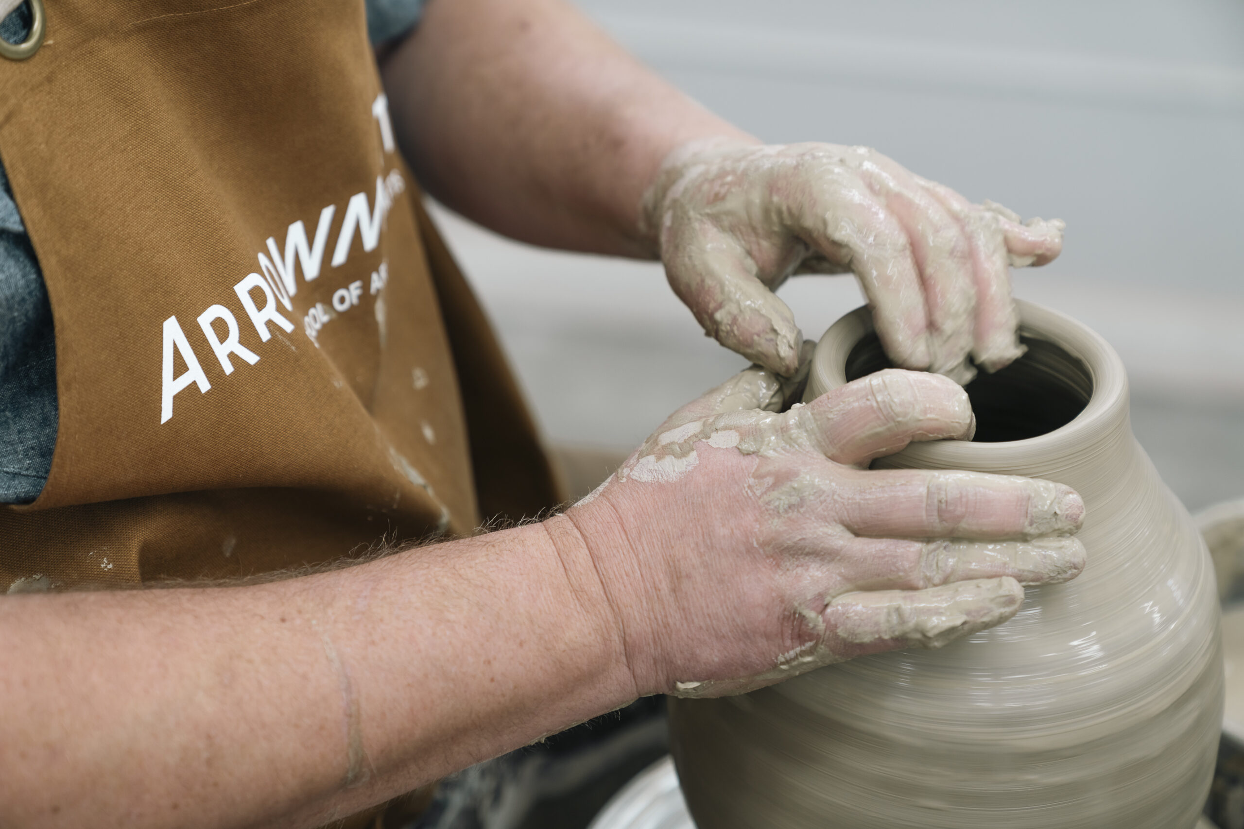
Arrowmont School of Arts and Crafts is a nationally recognized center for contemporary art education, nestled in the heart of Gatlinburg, Tennessee. For more than a century, it has served as a creative haven where tradition meets exploration—offering immersive workshops, residencies, and exhibitions that attract artists from across the country and around the world.
As the school continues to evolve, so must the way it presents itself. To ensure Arrowmont’s visual identity reflects the depth, warmth, and ambition of its mission, a rebranding effort was launched—one rooted in research, shaped by community voices, and designed to carry its legacy forward with clarity and strength.
Listening Before Designing
Before the first sketch—before moodboards or font explorations—we started with a question:
What does Arrowmont mean to the people who know it best?
That question wasn’t rhetorical. It was the spark that launched a deeper exploration—one that would carry us through interviews, surveys, open comments, concept testing, and critical creative decision-making. Arrowmont School of Arts and Crafts wasn’t just seeking a visual refresh. It was making a statement: this place, with its Appalachian roots and globally respected craft tradition, is stepping forward. And that step needed to be deliberate, grounded, and brave.
We began the process by engaging Arrowmont’s internal community—staff, instructors, alumni, and board members—in a foundational survey. We weren’t looking for surface opinions. We wanted unfiltered insight into how people inside the organization perceived the brand, what they valued about it, and where they felt it was falling short.
The feedback was clear.
Arrowmont’s identity is deeply tied to its sense of place. Its visual language needed to speak to Appalachian authenticity, craftsmanship, and a sense of creative sanctuary. This is a school rooted in process and practice—not spectacle or trend. Many said the current brand didn’t reflect that truth. It felt outdated. Flat. Lacking the spirit and texture that define the day-to-day experience on campus.
There was also a repeated dichotomy that bubbled up: Arrowmont is intimate and traditional—but also evolving. It welcomes serious makers, but it also invites play, exploration, and artistic risk. Any new branding had to hold both ideas. It couldn’t flatten the nuance to fit a trend. It had to earn it.
From Insight to Direction
With those truths in hand, our team moved into creative concept development. We built three distinct visual directions—each grounded in the school’s values, but exploring different aspects of its identity:
- Concept 1 leaned into tradition, earthy tones, and hand-touched design elements.
- Concept 2 focused on vibrancy, play, and community.
- Concept 3 embraced bold, graphic formality—pushing the brand into a more structured, masculine space.
Then we put them to the test.
The Voice of the Community
Over 200 participants, representing current students, alumni, instructors, and staff, took part in our concept evaluation survey.
The data left no room for guesswork.
- Concept 3 was the outlier. It underperformed in every demographic group and failed to resonate across all six core brand attributes tested.
- Concepts 1 and 2 landed in a statistical tie—each bringing something meaningful to the table.
- But Concept 1 held broader, deeper appeal. It connected across age groups and roles. It scored highest on “Appalachian tradition,” “crafted,” and “escape”—words that emerged again and again in open comments from internal stakeholders.
When we looked closer, the story became even more telling.
Participants ages 25 to 34 overwhelmingly preferred Concept 1. They called out its honesty, the richness of texture, and the way it captured “what Arrowmont feels like.” Older audiences agreed, appreciating its seriousness and warmth. Concept 2 did gain traction for its energy and playfulness, especially with younger audiences, but concerns surfaced about whether it drifted too far from Arrowmont’s roots.
What They Said
The open comments revealed as much as the numbers:
- “Concept 1 feels like Arrowmont. It has soul.”
- “#2 is fun but feels generic—could be any arts organization.”
- “#3 looks like a tech startup or a gym. Too cold. Too masculine.”
We heard concern about imagery feeling too busy or colors lacking warmth. But we also saw excitement. Participants weren’t only judging design; they were responding emotionally. That’s the kind of engagement that signals brand traction.
Strategy Moving Forward
Concept 1 will serve as the foundation. It honors tradition, showcases craft, and balances seriousness with creative warmth. But we’re not ignoring what worked in Concept 2—there’s value in its vibrancy and openness. Select elements from that direction can and should influence the final system. That might mean a broader color palette, looser typographic rhythm, or unexpected image moments that add spark.
Arrowmont is moving forward with a brand direction that reflects both its heritage and its forward momentum. Grounded in research and shaped by the voices of its community, the new identity gives the school a clearer, more confident way to show up—today and into the future.